 ⇦
⇦
2023-11-16
UpSet plots are not widely known and are useful for understanding the intersections of categorised data - think of them as Venn diagrams on steroids. Let's go straight to an example:
First, let's put data into a csv file, in this case from Postgres:
psql postgres://... -t -A -F ',' -c \
'COPY ( SELECT ... ) TO STDOUT WITH CSV HEADER' > ~/example.csv
Our example data looks like:
id,animal,dob
1,cat,2021-01-01
2,dog,2021-01-02
3,cat,2021-01-03
4,cat,2021-01-04
5,snail,2021-01-05
6,dog,2021-01-06
Now we set up a Python environment with all the libraries we need:
mkdir i-can-do-data-science; cd i-can-do-data-science
python -m venv venv; source venv/bin/activate
pip install pandas jupyter upsetplot
jupyter notebook  # this will open a browser window
Let's import some junk in a new cell:
import warnings
warnings.filterwarnings('ignore')  # Disable all warnings
from collections import defaultdict
import pandas as pd
import upsetplot
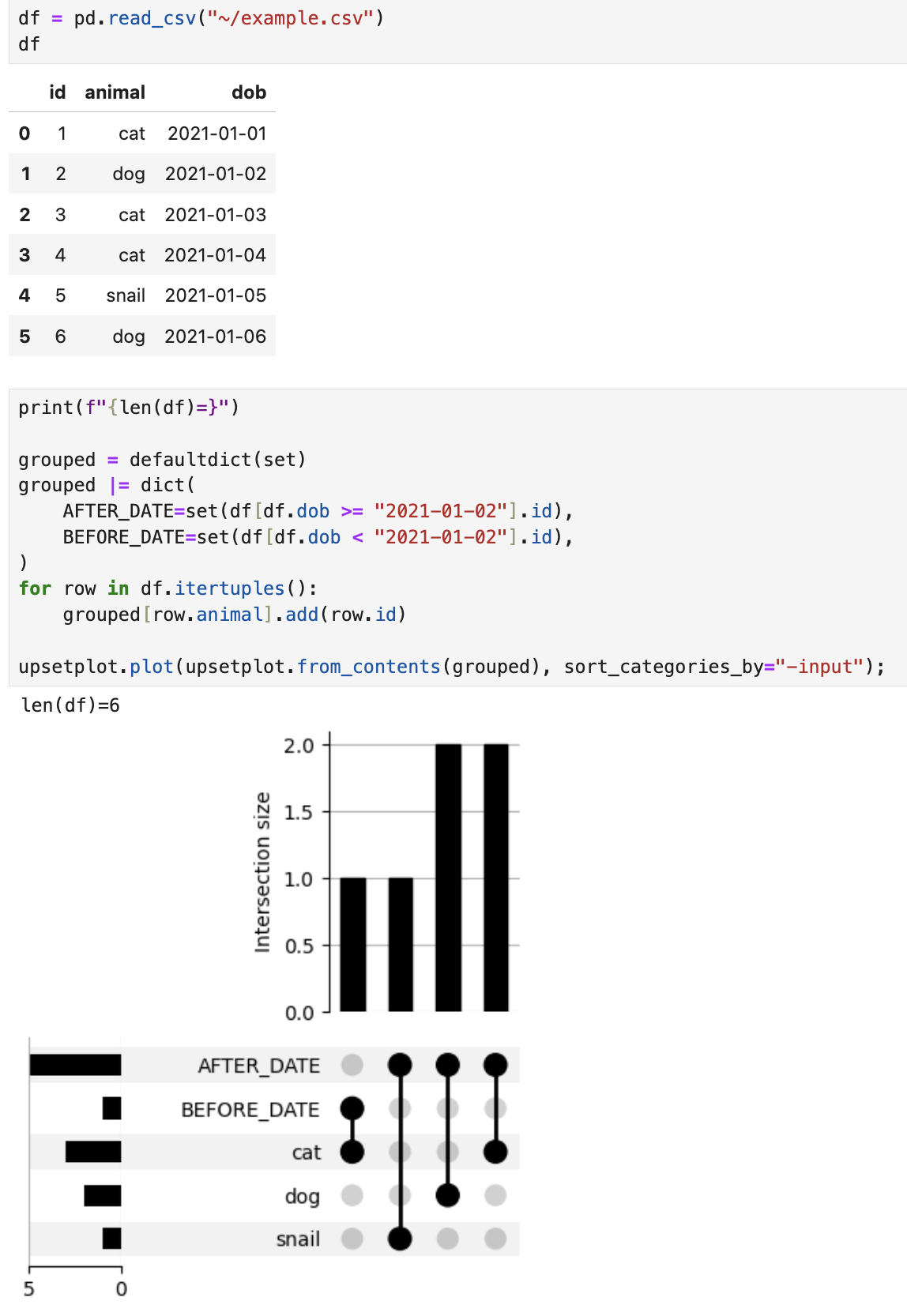
Now let's plot our data:

This is maybe not the most efficient way of doing things, but I find it the most intuitive. We simply construct a dict of "which ids are in which category":
grouped = {
    "CATEGORY_1": {"id_1", "id_2", ...},
    "CATEGORY_2": {"id_2", ...},
}
Our plot tells us some useful facts: